Change in Color
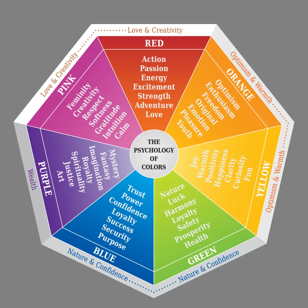
Color is the ultimate visual storytelling tool. A Masterclass Article explained, “different colors have different meanings, connotations, and psychological effects that vary across different cultures. Along with cultural differences, color psychology is largely impacted by personal preference.” The study of how specific colors impact human behavior has been coined: color psychology. It is built on the principles of color theory, which is the practical application of mixing and matching various hues to explore concepts like color perception and the effect of color combinations. The best way to exemplify this concept is how certain movies are color corrected to evoke different emotions. Companies are very purposeful about color choices in marketing and advertising. Color can subconsciously impact consumers from brand identity, customer targeting and conversion rates. Next time you see a flashing red timer as you are buying concert tickets, take a deep breath and do not let it pressure you.
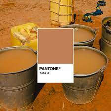
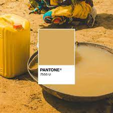
The Pantone Color Institute brand has become synonymous with color with its color of the year initiative and other efforts. The about page on the Pantone website says, “The Pantone Color Institute provides customized color standards, brand identity and product color consulting as well as trend forecasting inclusive of Pantone Color of the Year, Fashion Runway Color Trend Reports, color psychology and more. The brand is pivoting from these brand staples and applying its expertise to shed light on a new selection of shades: the colors of water insecurity. The “Color of Dirty Water” campaign was launched for World Water Day and will run through April to paint the picture of the reality 771 million people around the world face without access to clean drinking water. Knowing how vital color is to our everyday lives and choices, the campaign is even more powerful for an important cause.

The charity: water website features six striking colors that would be beautiful in any artwork, but not in a glass. Each of the six Pantone colors points to a story and location to allow for a human connection beyond color and something most Americans cannot imagine. The website is filled with sharable content; the slogan “Go ahead. Throw some shade(s). Show the world dirty water’s true colors.” is both powerful and trendy. The campaign is tasteful in that it brings light to an issue in a way that is digestible and comprehensible. My jaw dropped when I saw the Pantone colors overlaid on pictures of water sources across the world. The visual elements of the campaign are also even more moving because it amplifies the fact that each person faces a different challenge depending on where they are in the world. The one thing that these communities share is the shade disparities in their drinking water.

World Water Day began in 1993 and is observed by the United Nations every year on March 22. World Water Day “celebrates water and raises awareness of the 2 billion people currently living without access to safe water. A core focus of World Water Day is to inspire action towards Sustainable Development Goal (SDG) 6: water and sanitation for all by 2030,” according to the official site.
This is not the first time Pantone has used color as a teaching tool; in 2021, Pantone and Highland Spring teamed up to create a color palette to help people visualize if they are dehydrated. Pantone also has made other efforts to impact sustainability, such as its partnership with menswear brand, Corridor, to streamline its color and design process with Pantone Fashion, Home + Interiors (FHI) integrated design solution.

“Color is the ultimate communications tool. It doesn’t simply convey important information; it also has the power to create feelings and even actions,” Lindsay Scheinberg, social media lead at Pantone, said in a statement to Adweek.
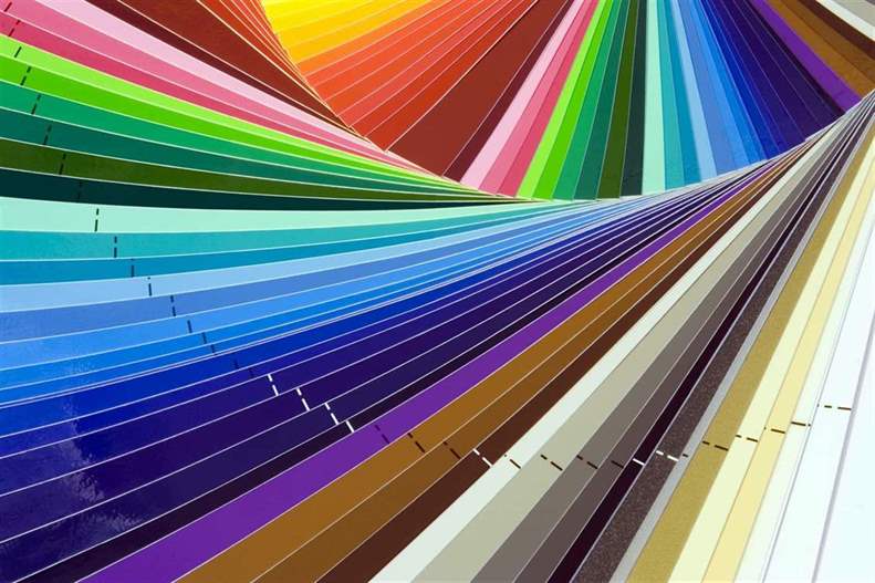
The Pantone Color System is a way of communicating using color in itself. The concept is fascinating; The Pantone Color System, or PMS, is a standardized color matching system that is widely used around the world. Manufacturers around the world can use the color system and know that the colors will be consistent. The standardization involved in the system removes the guesswork from the equation and is revolutionary for unvarying tones in artwork or brand logos. It was devised to help printers and designers specify and control colors for printing projects. The Pantone Color System allows you to distinguish between colors that cannot be mixed in traditional CMYK. Over 1,000 colors are identified in the Pantone Color Matching System, including metallic and fluorescent colors.
More About The Author
Lia Esposito is a senior at the University of North Carolina at Chapel Hill pursuing a degree in Media and Journalism concentrating in Advertising and Public Relations with an English Minor. She is currently a social media strategist in the fintech industry.